Data Analytics Solution of the Year” 2026 in Agtech Breakthrough Awards 2026


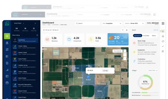
This document is a catalog of the operational dashboards and reports AgriERP produces for agribusinesses, focused on the two things that matter most in the field: yield (how much the operation is producing) and farm performance (how well the operation is running). It is the answer to “what reports will I actually get out of this system?” for the agronomy team, the farm management team, and the operations leadership.
Most of these dashboards are visible live on screen, in the web app and on the mobile app. All of them can be exported, scheduled, and shared. They are not reports built once a quarter; they are reports the system produces continuously, refreshed in close to real time, from the operational data captured everywhere else in AgriERP.
1. Yield dashboards
Daily harvest dashboard
- Headline numbers: today’s total harvest in bins, kilograms, or tonnes; vs. yesterday; vs. the day’s plan; vs. the equivalent day last season.
- By farm and block: broken down by farm, then by block. Top blocks of the day, blocks behind plan, blocks not yet started.
- By crop and variety: harvest split by crop and variety, with each variety’s progress against its planned harvest curve.
- By crew: output per crew, output per worker, productivity rate compared to the season norm, and to other crews working today.
- Time pattern: the harvest curve through the day, showing how the morning and afternoon shifts perform and where the peak is.
- Quality at intake: grade distribution of today’s harvest, with the share of Class 1, Class 2, and reject. Trends vs. recent days.
- Cumulative to date: season-to-date total against the season plan, with the projected end-of-season landing point given current pace.
Block performance dashboard
| Capability | What it means in practice |
|---|---|
| Yield per hectare or per acre | Tonnes per unit area, by block, this season. Comparison against the planned yield, against the same block in previous seasons, against comparable blocks. |
| Yield curve through the season | How the block’s harvest is distributed over time: early-season, peak, late-season. Useful for planning future seasons and managing the harvest schedule. |
| Quality profile | Share of each grade out of the block’s harvest. Better blocks show higher Class 1 share consistently. |
| Loss and reject rate | Tonnage rejected at intake, by reason: pest damage, disease, size, weather damage, handling. Patterns reveal upstream issues. |
| Year-over-year delta | How this season’s yield compares to last season for the same block, and to the multi-year average. Trending blocks (up or down) are flagged. |
| Cost per tonne | The block’s accumulated cost divided by its harvested tonnage. The first profitability indicator at the block level. |
Crop and variety performance dashboard
- Total yield by crop: season totals by crop, with year-over-year comparison and current-season trajectory.
- Variety comparison: within each crop, which varieties produced what yield, in what quality, at what cost. Drives variety-mix decisions for replanting.
- Maturity and timing: the timing of harvest for each variety. Early, mid, or late season; useful for buyer matching and dispatch planning.
- Seasonal yield curve: harvest distributed across the season, by crop, with comparison against previous seasons. Reveals whether the season is running early, late, or on schedule.
- Loss attribution: where shortfalls against plan come from: weather, pest, disease, agronomic, market-driven, harvest-timing. Useful for the season retrospective.
Multi-season yield trends
- 5-season trend by block: five years of yield per hectare for each block. Blocks trending down are candidates for investigation, replanting, or retirement.
- Variety performance over time: how varieties have performed across the years they have been grown. The data behind variety-mix decisions for next season’s planting plan.
- Best-vs-worst block comparison: the gap between the best-performing and worst-performing blocks of the same crop. The size of the gap is the size of the improvement opportunity.
- Weather and yield correlation: where weather data is available, how rainfall, temperature, and growing-degree days correlate with yield outcomes. Useful for seasonal forecasting and risk planning.
2. Farm performance dashboards
Labor productivity dashboard
| Capability | What it means in practice |
|---|---|
| Hours by activity | Total labor hours by activity type (spray, harvest, prune, pack, transport), this week and this season. Trends reveal where labor goes. |
| Productivity rates | Output per labor hour by activity: tonnes harvested per hour, cartons packed per hour, hectares sprayed per hour. Compared to the season norm and to historical benchmarks. |
| By crew and supervisor | Productivity broken down by crew. Top-performing crews and supervisors stand out; underperforming ones are visible for support or investigation. |
| Overtime and night work | Hours worked outside standard time, by activity and by crew. Useful for managing the labor cost and the workforce well-being. |
| Attendance and absenteeism | Show-up rates by crew, by day, by season. Patterns surface (Mondays vs. Fridays, payday effects, weather effects) and inform crew planning. |
| Cost per labor hour | Loaded labor cost per hour, by activity. Useful for benchmarking, planning, and cost-control. |
Equipment performance dashboard
- Utilisation by asset: hours used vs. hours available, by asset and asset class. The underused and the overused both surface.
- Downtime by asset: hours lost to breakdown, scheduled maintenance, idle, and unavailable. The composition matters as much as the total.
- Fault frequency: number of faults per asset per operating hour. Assets trending up are the candidates for refurbishment or replacement.
- Maintenance schedule adherence: share of scheduled maintenance completed on time. Compliance drops are an early warning of a maintenance team under pressure.
- Cost per operating hour: fuel + parts + maintenance + depreciation per operating hour, by asset. The data behind real replacement decisions.
- Total cost of ownership: cumulative cost across the life of each asset, alongside total productive output. The defining lifecycle number.
Work-order execution dashboard
| Capability | What it means in practice |
|---|---|
| On-time completion rate | Share of work orders completed within their scheduled window, by activity, by crew, by farm. Trends show whether operations is keeping pace with plan. |
| Backlog age | Open work orders by age, with the share aging out beyond their target window flagged. The early indicator of operational pressure. |
| Variance reporting | Where actual hours, inputs, or outputs significantly differ from plan. Patterns reveal recurring issues (consistent over-consumption of a specific input, persistent delays on a specific activity). |
| Cancellation and rework | Work orders cancelled, rescheduled, or reworked. Reasons aggregated; recurring root causes surface. |
| Throughput | Work orders completed per day or per week, by category, by team. The pulse of operational activity. |
Quality performance dashboard
- Acceptance rate: share of inspected lots passing acceptance, at every quality control point (receiving, in-process, pre-dispatch). Trending down is the leading indicator of quality issues.
- Reject by reason: rejection volume broken down by cause: pest damage, disease, size, foreign matter, packaging, handling. The reason mix points to upstream root causes.
- Grade distribution: share of harvest, production, or output landing in each grade. The premium-grade share is often the single most commercially important metric.
- Customer claims and feedback: quality-related claims from customers, with the volume, value, and root cause. Patterns reveal whether the operation is delivering the quality the market expects.
- QC turnaround time: time from sample taken to test result released. Slow turnaround creates inventory hold-ups and dispatch delays.
Inventory and capacity dashboards
- On-hand by class: raw materials, WIP, finished goods, by item and value. The headline inventory picture.
- Aging in storage: share of inventory by age bucket. The amount of stock at risk of expiry, downgrade, or write-off.
- Storage capacity utilisation: how full each warehouse, zone, and bin is. The bottleneck warehouses are visible in seconds.
- Inbound and outbound flow: receipts vs. dispatches by day or week, with the resulting inventory level. The shape of the cycle.
- Shortage flags: where projected demand exceeds projected supply, by time bucket. The early warning system covered in detail in the Inventory Monitoring module.
3. Distribution channels and refresh
How dashboards reach their audience
- Live screens in the web app: the primary channel for office-based users. Always current, always interactive.
- Mobile views: compact dashboard views on the mobile app for managers in the field. Same numbers, optimised for the phone.
- Scheduled email summaries: daily, weekly, or monthly email snapshots of key dashboards. The headline numbers in the inbox without users having to log in.
- Operations-room screens: large display screens in operations rooms and packhouses showing the live operational picture. Teams gather around them naturally.
- Exports: any dashboard or report can be exported to spreadsheet, PDF, or other formats for offline review, board packs, or external sharing.
- Embedded in external systems: where the business has its own portals or internal sites, dashboards can be embedded directly, so users see the same picture without learning a new tool.
Refresh and recency
- Real-time: operational dashboards that drive immediate decisions (work-order status, equipment use, today’s harvest) refresh in seconds.
- Near-real-time: dashboards that draw from heavier calculations (cost per tonne, productivity rates) refresh every few minutes or on demand.
- Periodic: dashboards driven by accounting or season-level aggregation may refresh nightly or weekly. The timestamp is always visible.
- Manual refresh: any dashboard can be force-refreshed if the user wants the absolute latest snapshot.
Why operational dashboards earn their keepOperational dashboards in this catalog are not the kind of nice-to-have reports that go into a folder and never get opened. They are the working surfaces of the operation. Production managers walk past the operations-room display every morning and adjust the day based on what they see. Crew supervisors open their phones during morning briefing and rebrief based on yesterday’s productivity. Farm managers email the daily harvest summary to the head office before lunch. None of this happens with quarterly reports; all of it happens because the dashboards live where the decisions are made.
In summary
Operational Dashboards in AgriERP cover yield (daily harvest, block performance, crop and variety analysis, multi-season trends) and farm performance (labor productivity, equipment performance, work-order execution, quality performance, inventory and capacity). They run on live or near-live data and are distributed through the channels each audience uses, web app, mobile, scheduled email, operations-room screens, exports, embedded widgets.
Combined with the Financial Reports document (the next in this section), they give the agribusiness the complete reporting surface needed to run the operation well, from the field crew supervisor to the CEO.