Data Analytics Solution of the Year” 2026 in Agtech Breakthrough Awards 2026


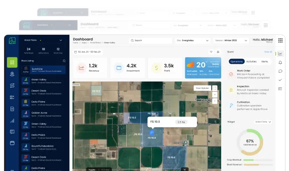
The dashboard is what most office-based users open when they log into the AgriERP web app. The farm manager checking how the property is running. The operations director starting their day. The CFO scanning financial health before a board call. The agronomy lead looking for anything that needs intervention. The dashboard is the answer to “what should I know right now?” delivered in one screen, designed so the answer can be absorbed in under a minute.
This document describes what the dashboard does, how it is shaped for different roles, what it shows, and how it connects to the rest of the system when the user needs to act on what they see.
1. Role-based dashboards
Default dashboards by role
| Capability | What it means in practice |
|---|---|
| Farm manager | Today’s work across the farm: open work orders, crews clocked in, equipment in use, current harvest counts, today’s weather, the week’s plan, any flagged exceptions. |
| Operations director | Multi-farm view: status across every farm, comparative productivity, current week’s deliveries against plan, open work-order backlog, equipment availability, labor utilisation. |
| Agronomy lead | Crop health view: scouting tickets open, spray windows imminent, pest pressure trends, agronomic calendar for the week, blocks flagged for intervention. |
| Packhouse manager | Production view: open production orders, line utilisation, today’s pack counts vs. target, quality holds, finished-goods inventory, dispatch schedule. |
| Sales director | Commercial view: open sales orders, contract fulfilment status, pricing performance, buyer activity, AR aging, sales-by-channel. |
| CFO and finance | Financial view: cash position, AR and AP aging, budget vs. actual headlines, working capital position, period-close status. |
| Grower program manager | Program view: active grower count, delivery progress, settlement run status, input-credit balance, quality acceptance rates. |
| CEO and board | Executive view: business-level KPIs, season-over-season trends, top-level financials, market and operational headlines, exceptions only. |
Customisation and configuration
- Default by role: every role has a default dashboard shipped with the platform. Users see something useful from day one, without configuration work.
- Personal adjustments: users can pin, hide, resize, and reorder widgets to match how they actually work. Personal layouts persist across sessions.
- Multiple dashboards: users with multiple responsibilities (an operations director who also owns the procurement function) can keep multiple named dashboards and switch between them.
- Business-level dashboards: the business can define standard dashboards for specific operational meetings (Monday ops review, weekly finance review, quarterly board). Anyone with access opens the same picture.
- Mobile reflection: where appropriate, the same dashboard is available in a compact form on the mobile app, so the user can check key numbers from the field.
2. The standard widget catalog
KPI tile widgets
- Single-number tile: the big number, with context: “Today’s harvest: 412 bins,” “Open work orders: 23,” “AR overdue: $148,000.” Often the first thing on a dashboard.
- Comparison tile: the number against a comparison: today vs. yesterday, actual vs. target, this season vs. last season. Direction-of-change arrow makes the trend visible.
- Progress tile: where a number tracks against a known target (harvest progress against the season plan, contract fulfilment against commitment), a progress bar shows the position visually.
- Status tile: a green/amber/red status for a system or operational area, with the rule that decides the status clear and the supporting detail one tap away.
Chart widgets
| Capability | What it means in practice |
|---|---|
| Time-series line | A metric over time: yield by week, cost by month, AR aging trend by week. The shape of the data over time is often more informative than the latest point. |
| Stacked bar | Composition over time: production by crop by week, expense by category by month. Shows both totals and the breakdown. |
| Comparison bar | Side-by-side comparison: farms vs. each other, crops vs. each other, weeks vs. each other, growers vs. each other. The visual ranking is immediate. |
| Distribution | Where the data is varied (cost per hectare by block, productivity by crew, margin by customer), the distribution view shows the spread and outliers. |
| Map heatmap | Geographically distributed metrics: yield by farm, grower density by region, pest observations by area. Spatial patterns visible in a single glance. |
| Sparkline | A small inline chart embedded in a KPI tile, showing trend at a glance without a full chart. |
List and table widgets
- Top N list: top customers, top growers, top blocks, top variances. Useful for the “who or what is driving this” question.
- Exception list: items that need attention: overdue invoices, blocked work orders, quality holds aging out, growers with overdue deliveries. The most actionable widget on most dashboards.
- Activity feed: recent events relevant to the user: work orders completed, deliveries received, payments issued, contracts signed. The pulse of the operation in chronological order.
- Approval queue: items awaiting the user’s approval: purchase orders, expense claims, contracts, exception requests. Inline approve and decline where appropriate.
Visual and spatial widgets
- Map widget: a live map showing farms, blocks, equipment, work in progress. The spatial view of the operation, embedded in the dashboard.
- Calendar widget: the week or month ahead: scheduled work, key delivery windows, contract dates, board meetings, holidays. Useful for managers planning the period.
- Weather widget: current weather and forecast for each farm, with the operational implications (spray windows, harvest delays, irrigation needs) flagged.
- Image gallery: recent photos from the field: harvest crews at work, quality issues, equipment faults, scouting observations. A glance at what the field actually looks like.
3. The KPIs that matter
Operational KPIs
| Capability | What it means in practice |
|---|---|
| Harvest progress | Tonnes or bins harvested this week, this season, against plan. Broken down by crop, block, variety. The single most important operational metric in harvest season. |
| Production output | Cartons, pallets, or units packed this shift, this day, this week. Against target. Tied to specific production orders for drill-down. |
| Yield | Tonnes per hectare, by block, by variety, by season. The agronomic KPI that drives almost everything else. |
| Labor productivity | Output per labor hour, by activity, by crew, by supervisor. Patterns are visible across crews and over seasons. |
| Equipment utilisation and availability | Hours used vs. hours available, by asset and asset class. With breakdown of operating, idle, in-maintenance, and unavailable time. |
| Quality acceptance and rejection rates | Percentage of received or packed product accepted at quality, by lot, by supplier, by block. Trends reveal upstream issues. |
| On-time delivery rate | Percentage of customer orders delivered within the agreed window. The headline service-quality metric. |
Commercial and financial KPIs
| Capability | What it means in practice |
|---|---|
| Sales by channel | Revenue split across domestic, export, retail, direct, and other channels, with margin per channel where available. |
| Contract fulfilment | How committed contract volume is tracking against actual delivery. Forward visibility on whether commitments will be met. |
| Order backlog and conversion | Open orders by stage, with the value at each stage. The pipeline view of revenue. |
| AR aging and DSO | Receivables by aging bucket, days sales outstanding trend, top overdue customers. |
| AP aging and DPO | Payables by aging bucket, days payable outstanding, upcoming payment commitments. |
| Cash position | Current bank balance plus expected inflows minus expected outflows, projected forward. The CFO’s primary view. |
| Working capital position | Inventory + receivables minus payables, with the breakdown by category. The size of capital locked in the operating cycle. |
Crop and profitability KPIs
- Cost per tonne by crop: the total cost (direct + allocated) per tonne of harvest, by crop and variety. The first profitability number for most operations.
- Margin per crop: revenue minus cost per tonne by crop, with year-over-year trend. Drives crop-mix decisions.
- Margin per customer: true delivered margin per customer, with all the cost of serving included. Often the most useful surprise on a properly-configured dashboard.
- Cost per labor hour: loaded labor cost per hour, by activity. Drives planning and benchmarking.
- Capital efficiency: operating margin per dollar of working capital. The number bankers and investors care about.
4. From dashboard to action
Drill-down behaviour
- Tile to detail: click a KPI tile and the dashboard opens the underlying breakdown. “Today’s harvest: 412 bins” expands to bins by block, by crew, by variety, with the hour-by-hour pattern.
- Chart point to records: click a point on a chart to see the underlying records: the work orders, sales orders, or production runs that produced the number.
- Exception list to record: click an exception (overdue invoice, blocked work order) and the user goes directly to the record where they can act on it.
- Map to detail: click a farm, block, or equipment marker on the map widget to open its detail in a panel or full screen.
In-dashboard actions
- Approvals: the approval queue widget allows approve or decline directly, without leaving the dashboard. The action posts; the queue updates.
- Quick filters: dashboards have a top-level filter bar (date range, farm, crop, region, business unit) that re-scopes every widget on the page consistently.
- Saved views: common scopes (this week’s mandarins on the south farm, last season’s pricing analysis) can be saved as named views for one-click access.
- Refresh and timestamp: every widget shows when the data was last refreshed. Most are real-time or near-real-time; some heavier analytics refresh on a schedule. The user always knows the recency of what they are looking at.
- Sharing and embedding: dashboards can be shared as snapshots for board reporting, emailed as scheduled summaries, or embedded in internal portals where appropriate.
Why the dashboard is more than just a pageA well-designed dashboard does two things at the same time. It compresses the operational picture into a glance for routine review, and it expands instantly into the underlying detail when something needs investigation. The compression is what saves the manager from drowning in information; the expansion is what stops the manager from being blind when a number does not look right.
In summary
The web-app dashboard is the start point for most office-based AgriERP users every working day. Role-based defaults mean each user sees a dashboard shaped for their job from the first login. A standard catalog of KPI tiles, charts, lists, and visual widgets builds the dashboards consistently. The KPIs themselves are the ones that matter in agribusiness, harvest, yield, productivity, quality, contract fulfilment, AR aging, cost per tonne, margin per crop, not generic ERP metrics. Drill-down from any widget into the underlying records turns the dashboard from a wall of charts into a working environment.
Combined with Planning & Control on the web app (the next document) and the office workflows it supports, the dashboard is what makes information work for the people who run the business.